With over 10,000 employees and 2,000 physicians overall, the award-winning Main Line Health is a not-for-profit health system serving portions of Philadelphia and its western suburbs. At its core are four of the region’s most respected acute care hospitals, as well as one of the nation’s premier facilities for rehabilitative medicine, among many other clinics and health-based services.
Over time Main Line Health has expanded as facilities and hospitals joined the organization. Even though a patient-focused experience is central not only to each individual location but also to the overall organization, the website experience was anything but. Over the years the site had grown organically, becoming a patchwork of 15,000 pages with duplicate content, combined with inconsistent navigation and link patterns.
The outcome was an incredibly confusing variety of layouts created over time, geared more towards how the organization itself was structured rather than how a patient or caregiver visiting the Web site would actually look for help for their healthcare needs. To add to this frustration, poor messaging had resulted in potential patients being unclear as to what Main Line health was exactly, and generally found the site cold and unwelcoming.
How is the site performing over time?
Knowing MLH had chosen Sitecore as their CMS, Palantir was selected to complete a comprehensive strategy and design engagement that would solve a handful of business problems.
The new MLH site needed to:
- Take several hospitals, clinics, and offices and house them under one cohesive and branded look
- Have a modular design system that was flexible enough to grow as the organization expanded
- Be patient-focused in both tone and structure
- Visually reflect the quality care provided by MLH as an institution
- Be designed for use on mobile devices
- Improve the content strategy
- Be as transactional as possible, with data to track improvements
Additionally, the designs needed to be packaged in code to enable a seamless handoff to a Sitecore vendor who would be completing development of the site.
In order to best tackle these issues, we broke the project into three main areas.
- Discovery and Research: a thorough analysis of audiences, data, goals, and metrics.
- Structure and Content: based on the research, we created a revised information architecture, suggested a content strategy, and made recommendations on governance.
- Design and UX: the final piece was translating the research into a visual interface that met the goals for the project and supported the final structure.
Let's dig a little deeper into what was involved in each phase.
Discovery and Research
Metrics on the current site provided a wealth of information to start our research. By looking at how the traffic was engaging with the site and what search terms were being used, we were able to make some key decisions on where to focus our time on fixing the biggest pain points.
For example, the second most searched for term for a patient was “find a doctor,” and yet only 10.15% of all visitors viewed any physician profile. Users were also giving up when trying to make an appointment, and studying traffic sources gave MLH insight into where it should spend its advertising dollars for paid search.
The most shocking statistic of all: of the 15,000 pages on the MLH website, the top 20 pages accounted for 52.63 % of all pages viewed, and about 7,000 pages received no traffic at all.
Since the site was siloed per hospital rather than consolidated by medical condition, Google was spreading search results rather than aggregating to one page. The duplication of pages was confusing visitors, resulting in poor organic search rankings, and made it increasingly challenging for editors to manage the site.
Consolidating pages and reworking content types was critical in having the content work smarter for MLH. In addition to analyzing metrics, we held a series of kickoff meetings with stakeholders over several days to learn how different internal and external audiences use and react to the site. We studied competitors’ sites, conducted a card sort to look at ways to improve the information architecture, and solidified the goals of the project. Lastly, an online survey was emailed to 30,000 MLH email subscribers in order to get immediate feedback about what was working, what wasn’t, and what their priorities are when visiting the MLH site.
What better way to create a truly user-centric patient-first experience than by really getting to know the people who are visiting? Empathy mapping exercises helped us to get into the heads of audiences, from which we could create detailed user personas to deeply understand the best ways to create effective sites for patients and caregivers.
Armed with this research, we were able to determine how best to break out of the traditional organizational silos and provide content that created a truly user-focused experience. We drafted a comprehensive Strategy Report that outlined all the goals, data and personas, as well as a revised content strategy, an initial pass at the information architecture, and governing and staffing recommendations.
This document created a roadmap for the Palantir team moving forward, and also allowed the Main line Health team to show progress on the project to internal stakeholders.
Structure and Content
Based on the research uncovered through Discovery, an initial restructured information architecture was created. In order to quickly validate the IA work, we ran an initial usability test using an online tool called Treejack to ensure that users were finding their way through common tasks. The results allowed us to see the paths that were chosen and the degree of success, so we were able to make informed decisions on where to tweak the site map to make it easier for users to find what they needed.
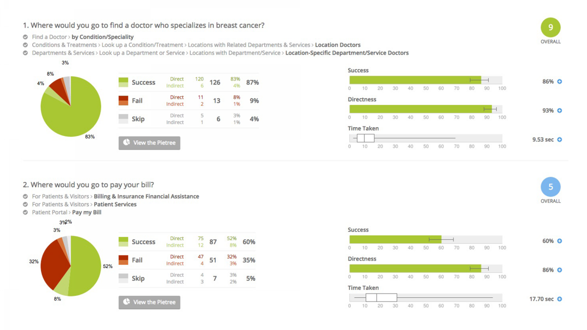
Examples of usability testing completed for Main Line Health on the information architecture. While the first task proved highly successful, the second task proved confusing to users. Adjustments to the information architecture were made to improve this task.
After reviewing the content, 16 content types were identified. These content types provided clear guidelines for editors to know exactly how to best structure the content when writing—which included writing for “chunks” rather than “blobs,” and recommendations on keeping the writing concise for quicker reading on mobile devices.
An internal governance chart was created to help MLH editors know exactly how the flow of content would work: from the type of content being produced (e.g. - was it about a medical condition or treatment? Or was it one of their programs or services?) to the approval process itself. Auditing existing content became easy, since the team was able to make some quick decisions on which content to delete, archive or rewrite based on the data uncovered from Google Analytics.
Design and UX
With the research completed and the content underway, it was time to start creating an appealing visual way to deliver all the information to users online. First we created a series of style tiles that gave a sense of color palette, button and photography styles, and typography. They also helped us determine the direction for the overall tone and mood of the site.
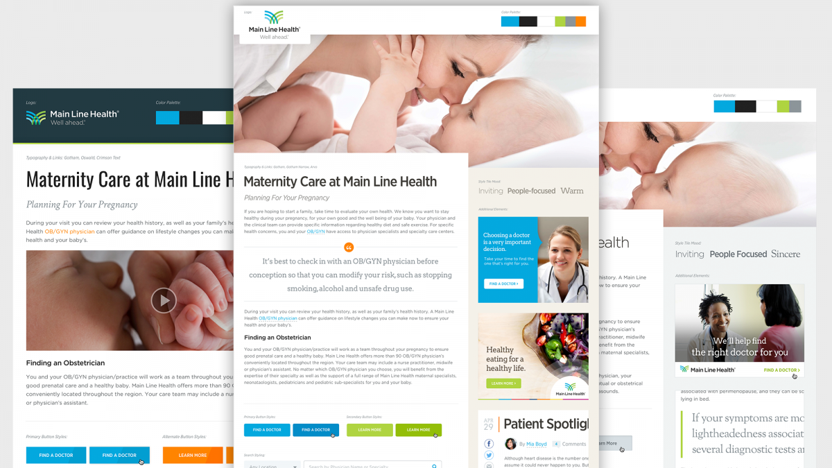
Three initial style tiles presented: the first set a tone of inviting, people focused, and sincere. The second was technical, progressive and strong. The third was more warm, trusting and personal. These helped MLH decide which visual direction represented them best.
Once a direction was chosen, we began working on wireframes in order to bring structure to the functionality and to begin the transition to development. Low-fidelity wireframes were translated quickly into the prototypes built with HTML/CSS, where we could then see the final designs working in all devices. Additional templates and prototypes were created as each set of pages were approved, with 27 completed in all to cover every possible scenario needed.
To make sure we were on the right path, we tested the site again using the designs to make sure that the visuals were aiding the usability of the site. Using heat mapping software, we were able to validate that users were finding information easily, and that edits made due to the previous test showed measurable improvements in usability.
Once all of the design components and final templates were completed, they were all captured in a living style guide that chronicled all aspects of the design system (individual pieces such as button styles, full landing pages, and the working code for each). This ensured all site maintainers a foolproof method to extend sites in the future as needs change—whether those are business in nature or related to specific patient needs.
A Flexible Design
After our style guide was transitioned to the development team for a Sitecore build, Palantir provided weekly consultation to answer any outstanding questions or provide guidance toward the design. By creating a truly modular and flexible site that leverages the power of SASS for a wider range of control over typography, color variables and grid structure, the development vendor could take this code directly and create the website, communicating design intent in the language of the web.
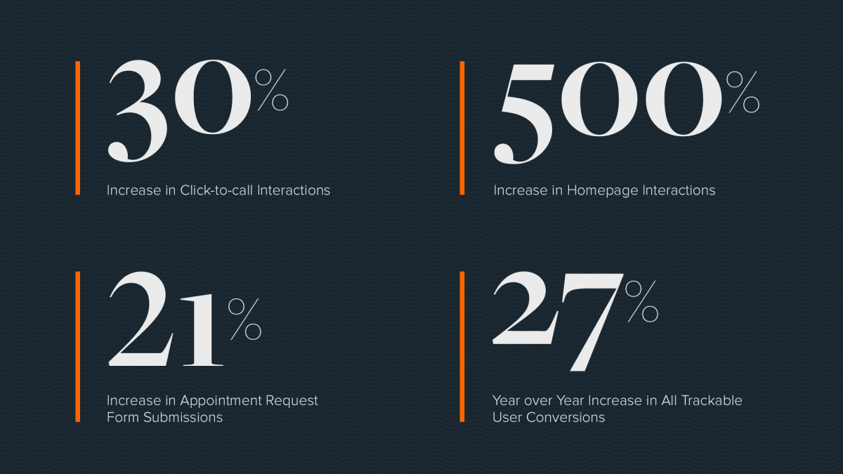
Palantir.net provided us with design ideas and UX recommendations which have improved user engagement and satisfaction in key areas of our site. From our 67% increase in users engaging with provider profiles and a 23% gain in users browsing locations in the first year post-launch to a 73% increase in users viewing specialty and service content, our engagement brought measureable value to the organization's digital marketing efforts.
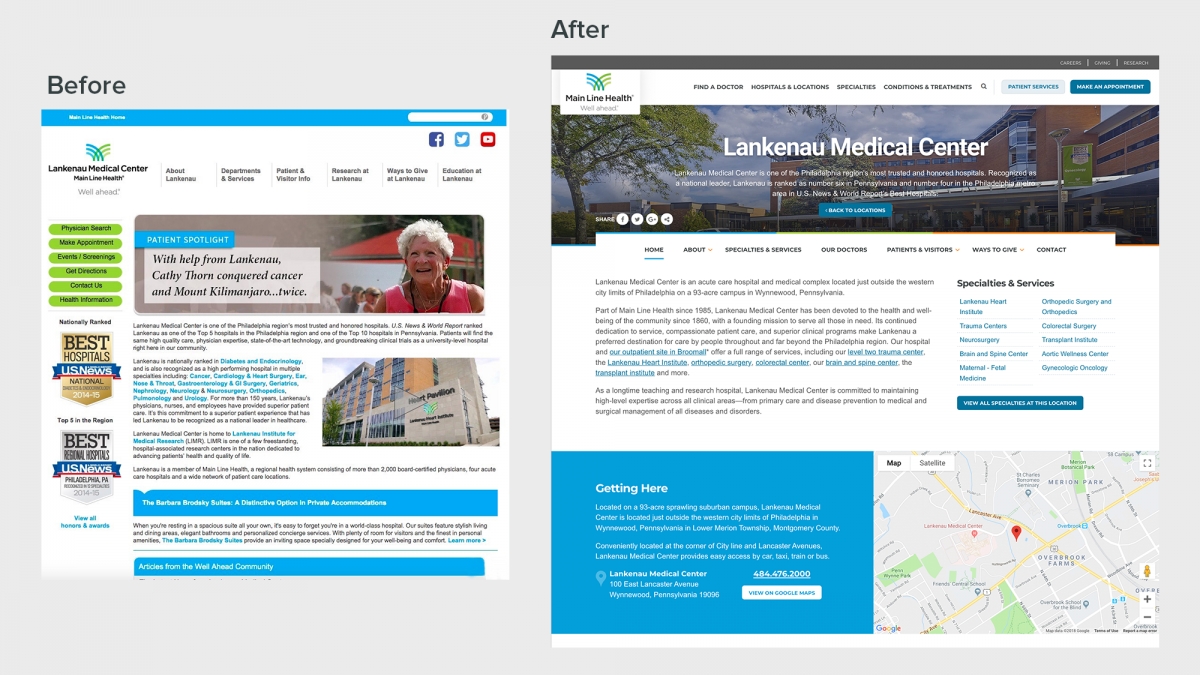
Feedback on the look and feel of the site has proven that we were able to turn a typical, hospital-centric website into a patient-focused site with clear hierarchy that creates a sense of confidence and quality care. Back-end editors appreciate that they can tailor their message and design elements to patients, making sure that they truly come first. The combination of elegant and compelling design components and photography with real-world, data-backed research will create success for all Main Line Health patients and providers for years to come.
This project won an award for Best Internet Homepage in the 2017 eHealthcare Leadership Awards.
