Behind the Design: The Ford School of Public Policy
Embracing a minimalist feel to bring personality to a storied university.

We’re going to take a peek into our process and how we arrived at the specific design decisions for The Ford School of Public Policy at the University of Michigan. If you want more in-depth information on strategy and technical process, take a look at our case study.
Getting to know you
Before we thought about sketches, wireframes, and high-res comps we needed to know more about the University of Michigan Ford School. What does their brand stand for? What elements should be pushed and expanded, what others are standards, and which should be left alone or worked around? How should it feel to know and interact with their brand? If we personified The Ford School and met them at an event, what’s their personality like? These are some of the questions we ask to pull information that can’t be found in data or a spreadsheet. Emotions and feelings play a big role in how design is interpreted, and how people build connections with digital elements. These connections ultimately outlast the time they spend interacting with any given site.

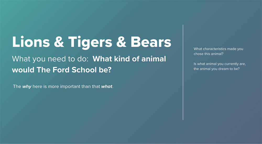
Design for the Job You Want
We used style tiles for an easy gut check of a visual direction. We explored a variety of aesthetics while keeping some key things in mind, such as understanding our main audience. How does design influence our goals of creating something that prioritizes prospective students, but also appeals to a wide range of audiences? We centered our efforts around a few words and phrases that emerged out of the discovery phase, such as “intelligence”, “transparency”, “trust”, and “professional yet informal”. We also had some design specific ideas we wanted to make sure were evident in the style tiles, such as warmth, breathing room, vibrant, bold, and timeless.
I love where you took the look-and-feel of our site, and we continue to get positive feedback from others about it all the time. Your collaborative and curious approach made the project both successful and enjoyable, even inspiring key refinements of the school's visual style across print and digital.
— Nick Pfost, Marketing & Communications Specialist
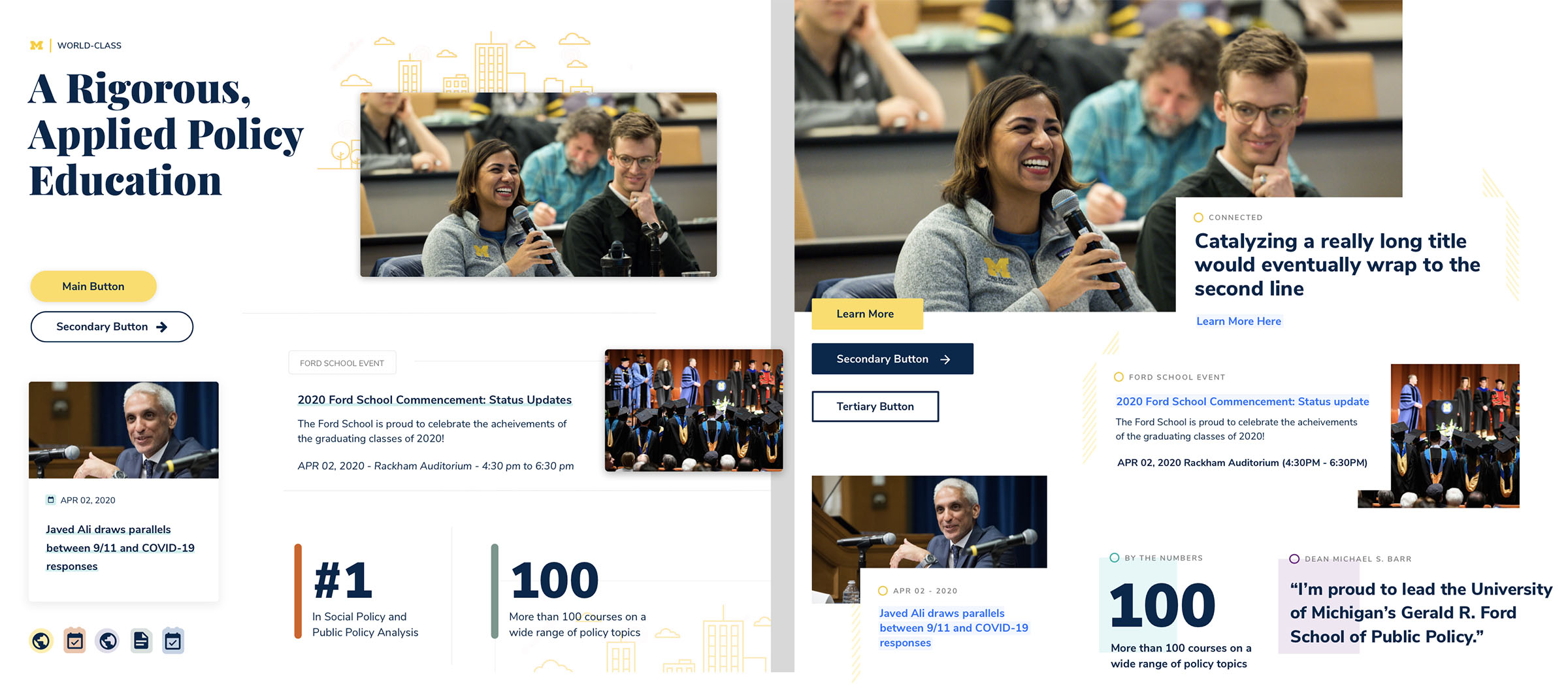
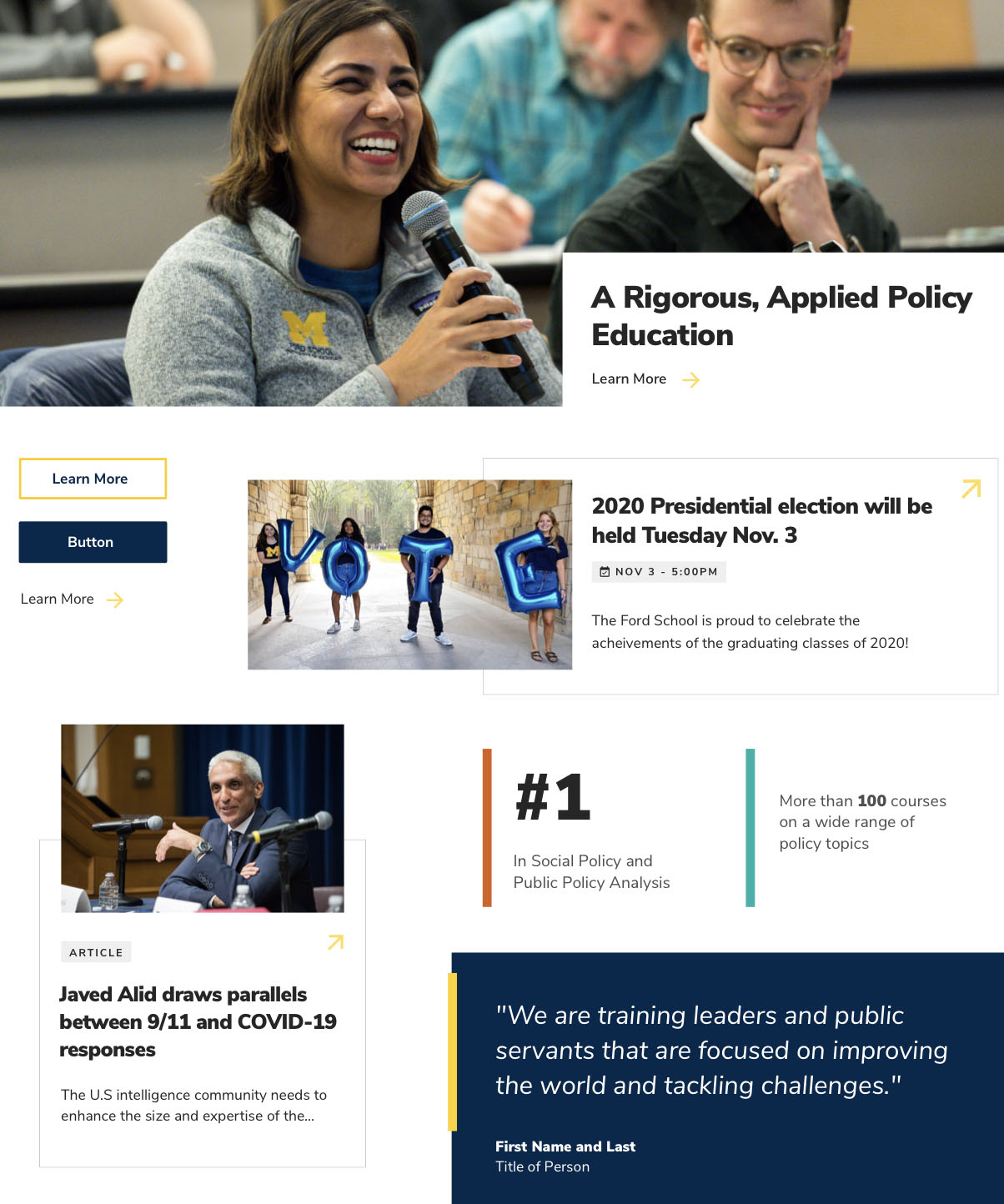
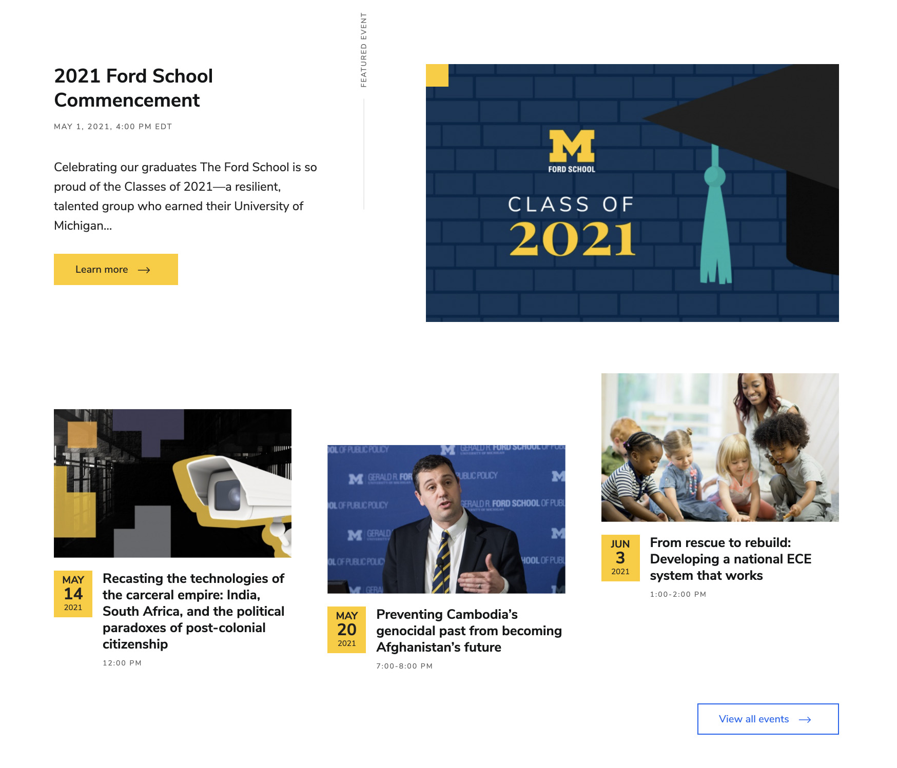
Through conversations and interactions with the Ford School team and stakeholders, we came to a minimalist, Swiss-based design aesthetic. Some of the Swiss design principles we incorporated were uniformity, consistency, a strong importance on typography, and giving elements substantial breathing room to create an overall look and feel that would be both functional and aesthetically pleasing. Typography would be used as our main design element along with the use of geometric shapes and lines. This gave our designs a timeless, minimal yet confident personality. This also emphasized the most important element to The Ford School and to us: the content. A minimal design delivers a level of invisibility. Embracing this allows users to comb through content, page by page, without any disturbance.
Design with Intent
In choosing this simplified design direction, we had to be sure that every element was created with intent. The simple shapes and lines can easily result in a layout that feels “unfinished”. This means that use of these simplistic elements had to look deliberate. To embrace the personality of The Ford School and to align with the Swiss aesthetic, we manipulated the structured grid to create more visual interest without obstructing the overall usability and functionality of the site.
We also wanted to introduce micro-interactions and animations to help pull some of the personality forward. These range from button interactions and underline animations to controlling how elements appear on a page when arriving. These animations had to align and add to our design personality, but not in any way distract or become a focal point.
We were tasked with stretching and evolving the visual brand tools of the Ford School, while also maintaining the familiarity and consistency that is the overall U of M brand. Using the famous maize and blue as our base, we designed new elements throughout the site and explored how to apply a typographic voice. Together, this helped cultivate the feeling of a new, fresh take on a very traditional style guide.
Conclusion
Since launch, we've also stood up over a half-dozen new landing pages--the components you designed have greatly improved our ability to do this quickly and with confidence that it'll look great on all our devices.
— Nick Pfost, Marketing & Communications Specialist
Learning The Ford School’s wants and needs brought out the best design aesthetic to represent their goals. We aimed to truly reflect what they stand for, and what they want to represent to prospective students, current students and alumni. We were able to push and evolve their existing brand into something that felt fresh while also paying homage to traditions of their institution.
