Design Systems at Scale: Streamlining Creativity and Consistency
A design system gives you a “Lego box” of components that you can use to create consistent, beautiful interfaces.
Design System artifacts go by many names - Living Style Guides, Pattern Libraries, UI Libraries, and just plain Design Systems. The core idea is to give digital teams greater flexibility and control over their website. Instead of having to decide exactly what all pages should look like in one big redesign and then sticking with those templates until the next redesign, a design system gives you a “Lego box” of components the team can use to create consistent, beautiful interfaces. Component-based design is how you scale.
At Palantir we build content management systems, so we’ve named our design system artifact a “style guide” in a nod to the editorial space.
Our style guides are organized into three sections:
- 'Design Elements' which are the very basic building blocks for the website.
- 'Components' which combine design elements into working pieces of code that serve a defined purpose.
- 'Page Templates' which combine the elements and components into page templates that are used to display the content at destination URLs.
But how do we help our clients determine what the list of elements, components and page templates should be?
How to Identify Elements for Your Design System
In this post I’ll walk through how we worked with the University of Miami Health System to create a style guide that enabled the marketing team to build a consistent, branded experience for a system with 1,200 doctors and scientists, three primary locations, and multiple local clinics.
1. Start by generating a list of your most important types of content.
Why are people coming to your site? What content helps them complete the task they are there to do? This content list is ground zero for component ideation: how can design support and elevate the information your site delivers?
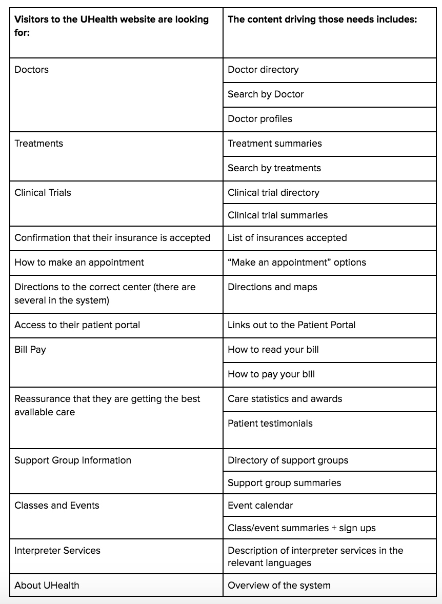
The list of content serving user needs is your starting point for components. In addition, we can use this list to identify a few page templates right off the bat:
- Home page
- Treatment landing page
- Search page
- Listing page: Search results, news, classes
- Clinical trials landing page
- Clinical trial detail page
- Location landing page
- Appointment landing page
- Appointment detail page
- Basic page (About us, contact us, general information)
This is just the start of the UHealth style guide; we ultimately created about 80 components and 17 page templates. But it gives you a sense of how we tackled the challenge!
2. Sort your list of important types of content into groups by similarities.
Visitors should be able to scan your website for the information they need, and distinctive component designs help them differentiate content without having to read every word. In addition, being rigorous about consistently using components for specific kinds of information creates predictable interfaces, and predictable interfaces are easy for your visitors to use.
In this step, you should audit the design and photo assets you have available now, and assess your capacity to create them going forward. If, for example, you have a limited photo library and no graphic artist on staff, you’ll want to choose a set of components that don’t heavily rely on photos and graphics.
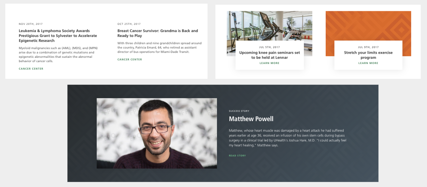
In this example, we have three component types: News, Events/Classes, and a Simple Success story.
- News Component: This component has no images. This is largely about content management; UHealth publishes a lot of news, and they didn’t want to create a bottleneck in their publishing schedule by requiring each story to have a digital-ready photo.
- Events/Classes Component: This component has an option for images or a pattern. Because UHealth wants visitors to take action on this content by signing up, we wanted these to have an eye-catching image. Requiring a photo introduces a potential bottleneck in publishing, so we also gave them the option to make the image a pattern or graphic.
- Simple success story: This is the most visually complex component because successful health narratives are an important element of UHealth’s content strategy. We were able to create a complex component here because there’s a smaller number of success stories compared to news stories or classes and events. That means the marketing team can dedicate significant time and resources to making the content for this component as effective as possible.
3. Now that you’ve sorted your list by content, do a cross-check for functionality.
Unlike paper publications, websites are built to enable actions like searching, subscribing, and making appointments. Your component set should include interfaces for your functionality.
Some simple and common functions for the UHealth site included searching for a treatment by letter, map blocks, and step forms.
In a more complex example, the Sylvester Cancer Center included a dynamic “Find a lab” functionality that was powered by a database. We designed the template around the limitations of the data set powering the feature, rather than ideating the ideal interface. Search is another feature that benefits from planning during the design phase.
For example, these components for a side bar location search and a full screen location search require carefully structured databases to support them. The design and technical teams must be in alignment on the capacity and limits of the functionality underlying the interface.
4. Differentiate components by brand.
UHealth is an enormous health care system, and there are several centers of excellence within the system that have their own logos and distinct content strategies. As a result, we created several components that were differentiated by brand.
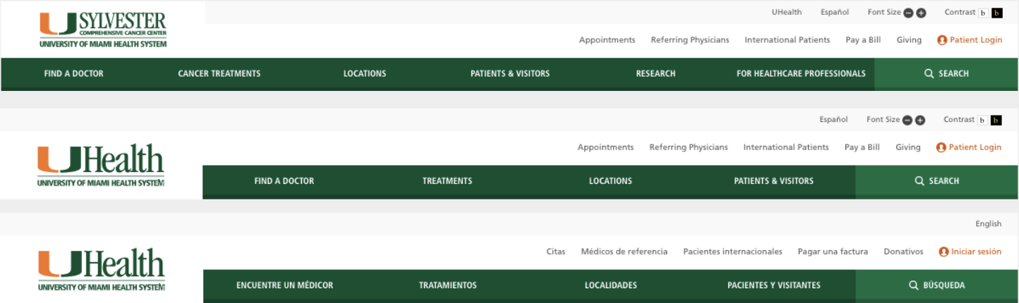
In this example, you see navigation interfaces that are different by brand and language. Incorporating the differentiated logos for the core UHealth system and the Centers of Excellence is fairly straightforward. But as you can see the Sylvester Center also has three additional top nav options: Cancer treatments, Research, and For Healthcare Professionals.
That content change necessitated a different nav bar - you can see that it’s longer. We also created a component for the nav in Spanish, because sometimes in other languages you find that the menu labels are different lengths and need to be adjusted for. In this case, they didn’t, but we kept it as a reference for the site builders.
5. Review the list: can you combine any components?
Your overall goal should be creating the smallest possible set of components. Depending on the complexity and variety of your content and functionality, this might be a set of 100 components or it might be just 20. The UHealth Design System has about 80 components, and another 17 page templates.
The key is that each of the components does a specific job and is visually differentiated from components that do different jobs. You want clear visual differences that signal clear content differences to your audience, and you don’t want your web team spending time trying to parse minor differences - that’s not how you scale!
In my experience, the biggest stumbling block to creating a streamlined list of components is stakeholders asking for maximum flexibility and control. I’ve found the best way to manage this challenge is to provide stakeholders with the option to differentiate their fiefdoms through content rather than components.
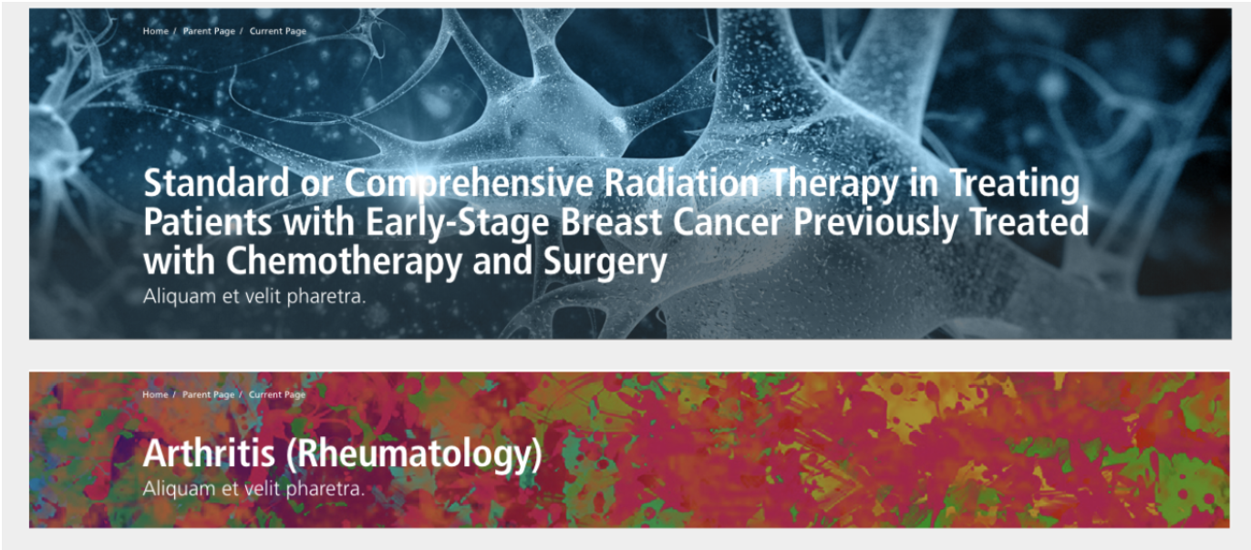
In this example, we have the exact same component featuring different images, which allows for two widely different experiences. You can also enable minor differentiation within a component: maybe you can leave off a sub-head, or allow for two buttons instead of one.
6. Start building your design system and stay flexible.
The list you generated here will get you 80% of the way there, but as you proceed with designing and building your design system, you will almost certainly uncover new component needs. When you do, first double-check that you can’t use an existing component. This can be a little tricky, because of course content can essentially be displayed any way you want.
At Palantir, we solve for this challenge by building our Style Guide components with real content. This approach solves for a few key challenges with building a design system:
- Showing the “why” of a component. Each component is designed for a specific type of content - news, classes, header, testimonial, directory, etc. This consistency is critical for scaling design: the goal is to create consistent interfaces to create ease of use for your visitors. By building our Style Guides with real content, we document the thought process behind creating a specific component.
- Consistency. Digital teams change and grow. We use content in our Style Guide to show your digital team how each component should be used, even if they weren’t a part of the original design process.
- Capturing User Testing. Some of our components, like menus, are heavily user-tested to ensure that we’re creating intuitive interfaces. By building the components with the tested content in place, we’re capturing that research and ensuring it goes forward in the design.
- Identifying gaps. If you’ve got a piece of content or functionality that you think needs a new component, you can check your assumptions against the Style Guide. Does the content you’re working with actually fit within an existing pattern, or is it really new? If it is, add it to the project backlog!
Outcomes
The most important takeaway here is that design systems let your web team scale. Through the use of design systems, your digital team can generate gorgeous, consistent and branded pages as new needs arise.
But don’t take our word for it! Tauffyt Aguilar, the Executive Director of Digital Solutions for Miller School of Medicine and UHealth, describes the impact of their new design system:
“One of the major improvements is Marketing’s ability to maintain and grow their site moving forward. Previously each page was designed and developed individually. The ability to create or edit pages using various elements and components of the Design System is a significant improvement in the turnaround time and efficiency for the Marketing department.”
My favorite example of a new page constructed with the UHealth design system is this gorgeous interface for the Sports Medicine Institute.

The Sports Medicine audience has unique needs and interests: they are professional and amateur athletes who need to get back in the game. The UHealth team used basic components plus an attention-grabbing image to create this interface for finding experts by issue.
And ultimately, that’s Palantir’s goal: your digital team should have the tools to create gorgeous, effective websites.
