Blog Post
Style Tiles: The Complete Guide
What are style tiles, why do they matter, and how can you make the most of them?

Style tiles are a great tool to start design discussions, and they are an important part of the design process. They allow for efficient, yet intense, design explorations and help capture a brand or organization’s personality in visual language.
In this post, we’ll discuss what style tiles are, how we use them at Palantir, and some best practices to make them an effective design and communication tool. More importantly, we’ll talk a bit about how as a client or a designer, you can leverage style tiles to get the most effective design results.
I first heard about style tiles in a blog post by Samantha Warren and the supporting website that documents the overall process. According to Warren, Style tiles are “a design deliverable consisting of fonts, colors and interface elements that communicate the essence of a visual brand for the web.”
The process and deliverables sounded great in theory, but would that theory move seamlessly into practice? The answer was ‘mostly’, and with a little bit of trial and error, they are now arguably the most important step in our design process.
Our Style Tile Process
In our typical process, we create three style tiles for a project. How do we get started? During design discovery, we use various exercises like Metaphors, ‘This? or That?’, competitive site review, and various other exercises to learn as much as we can about how to translate the brand look and feel in the digital space.
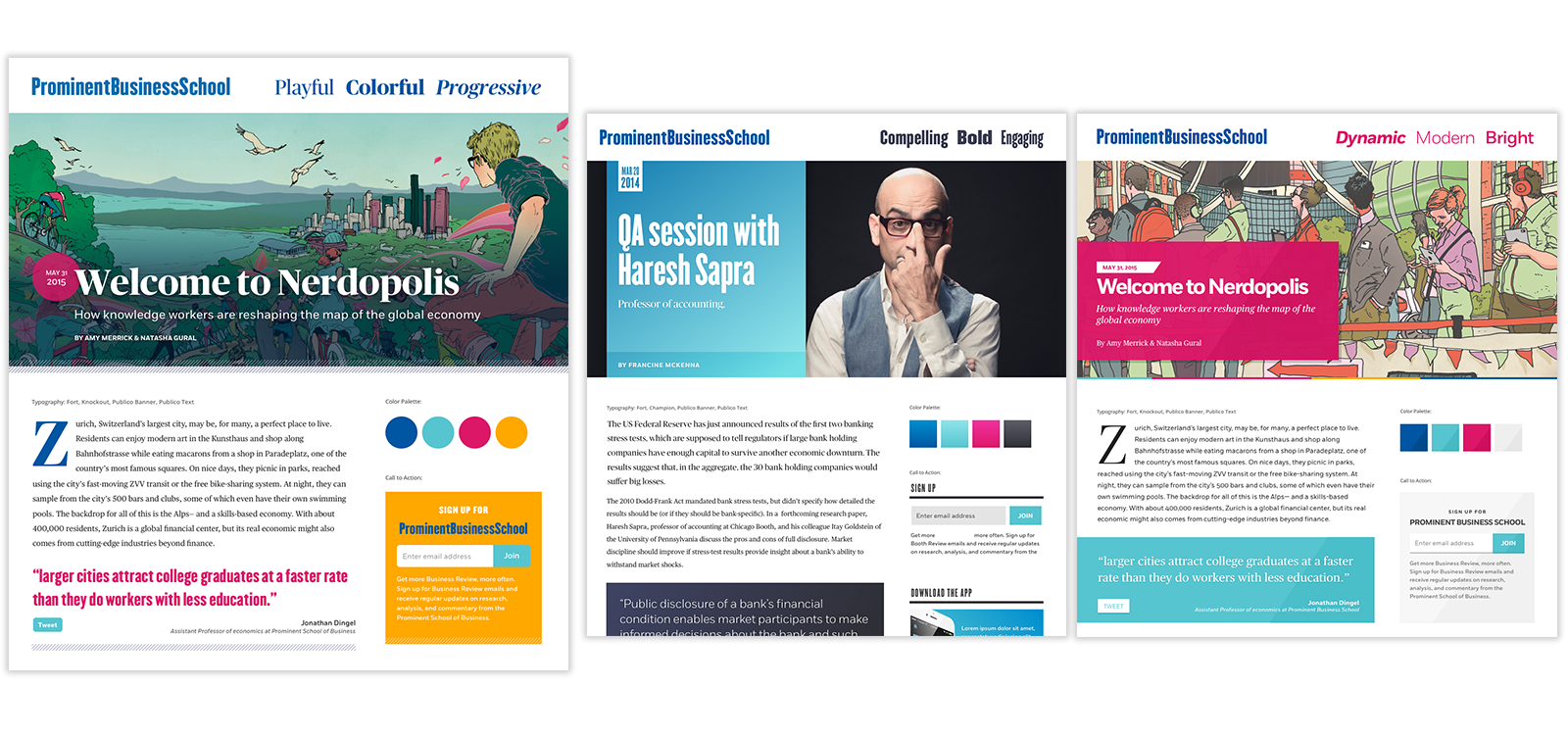
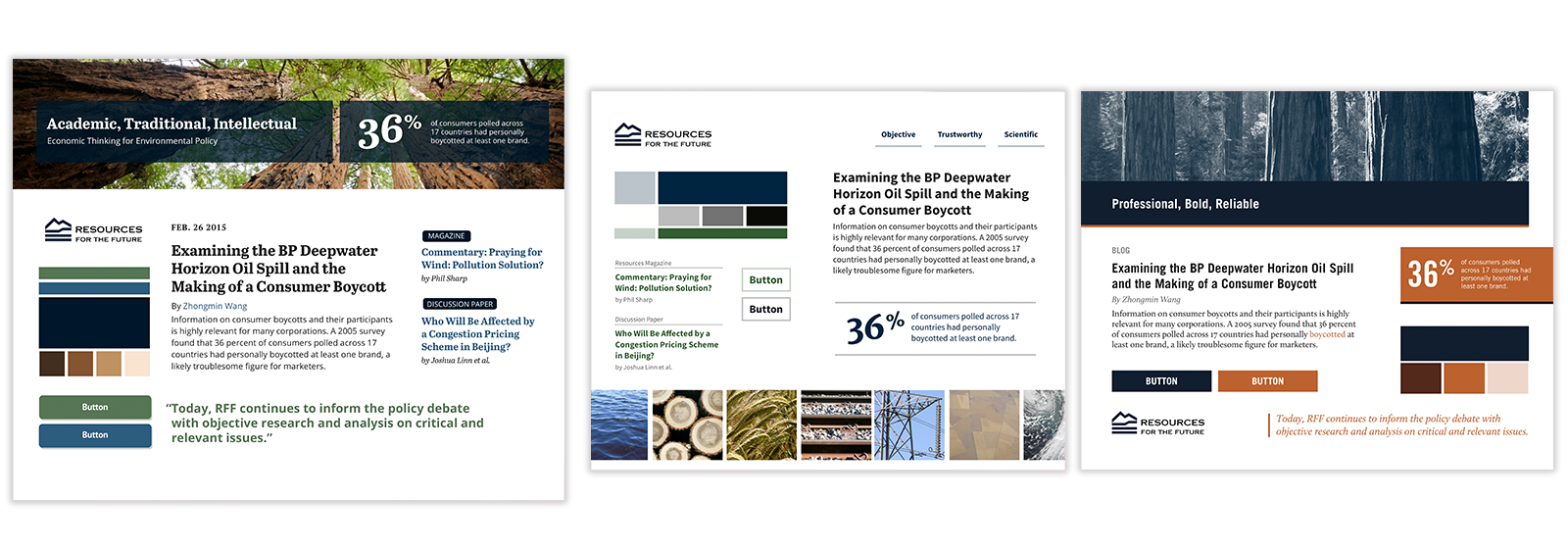
After the discovery process, we sit down with the gathered information to process and identify what important characteristics the site should have. Our goal is to identify three fairly different ‘personalities’ that the site could take on. Each personality represents a different way to showcase the brand essence in the digital space. Then we take these ‘personalities’ and use them to inform each style tile.
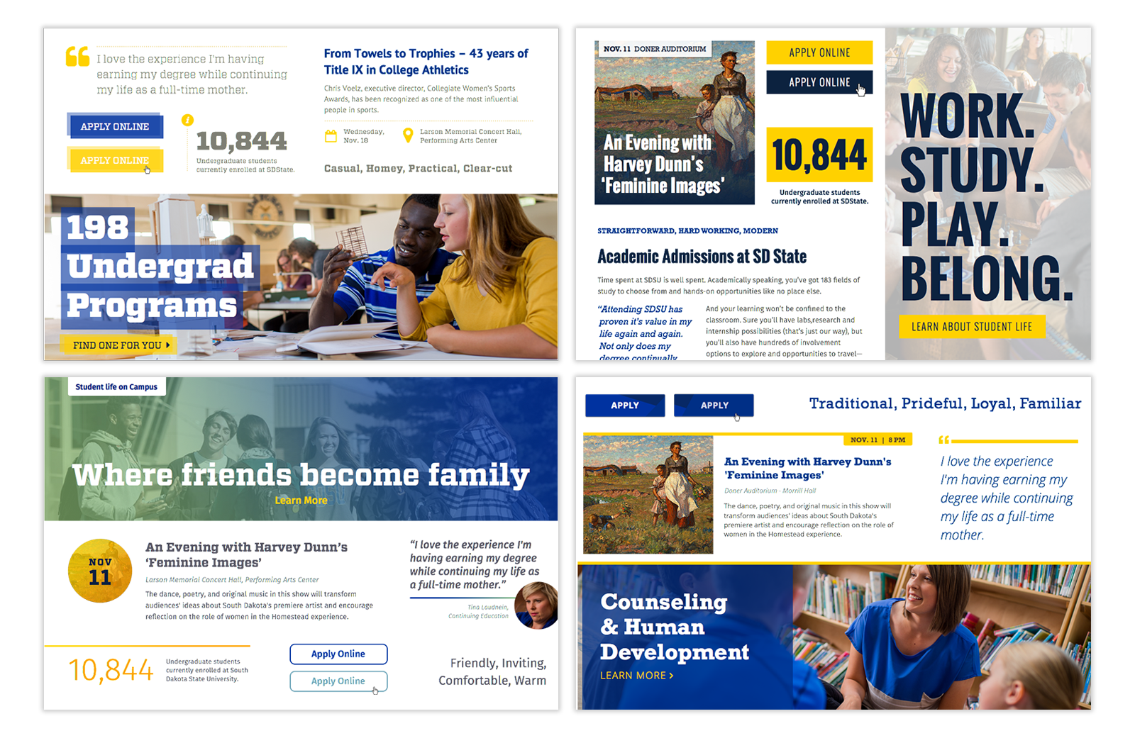
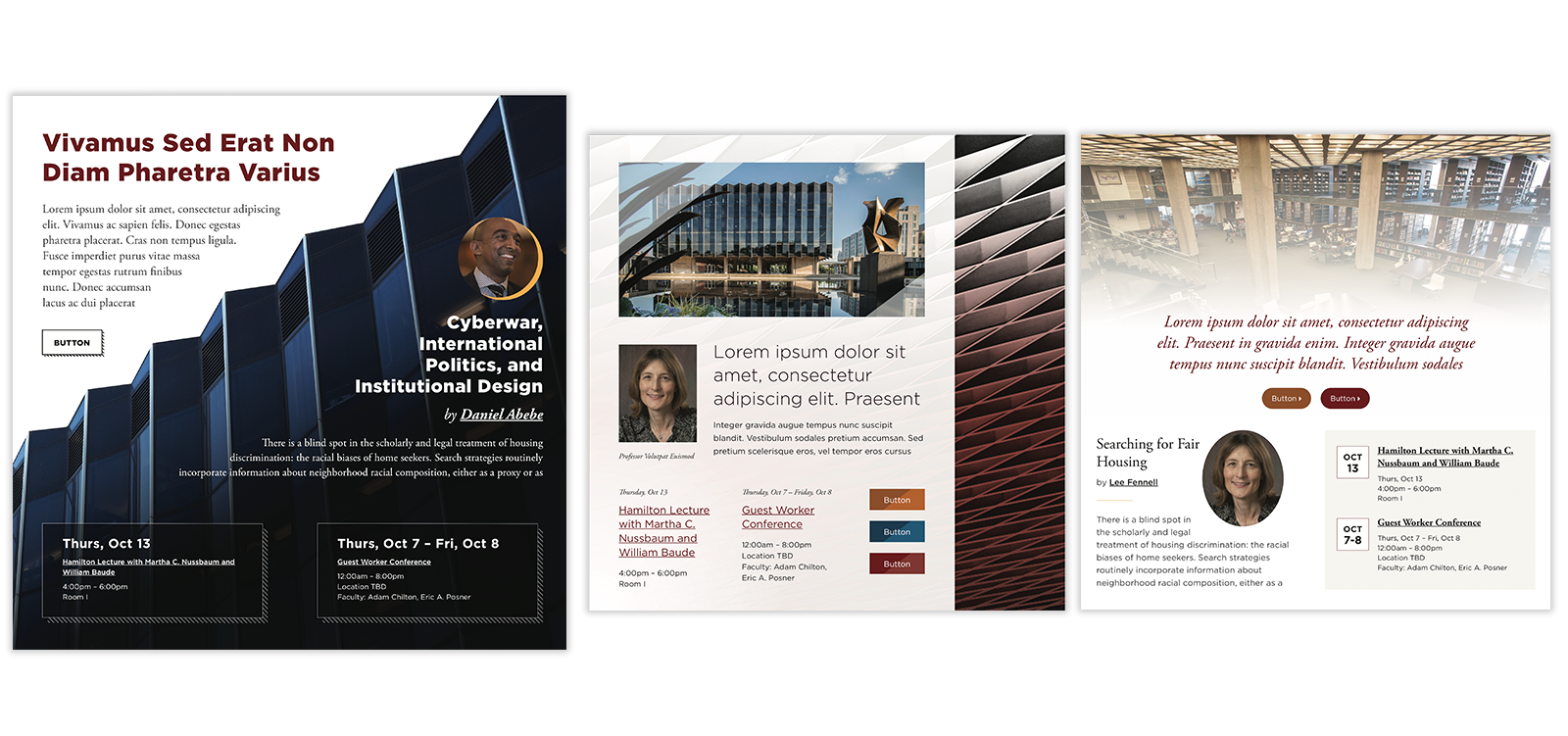
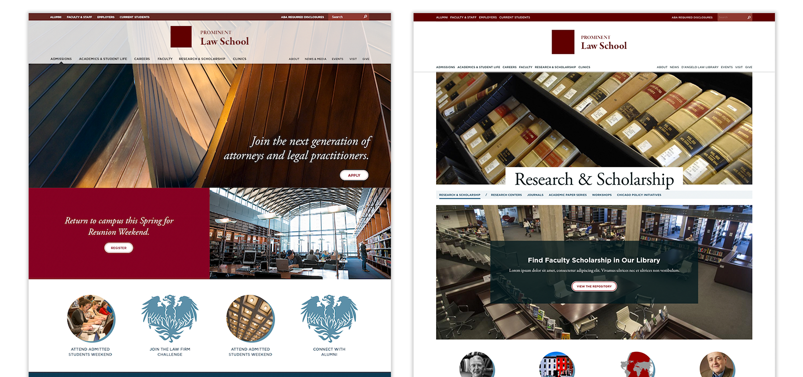
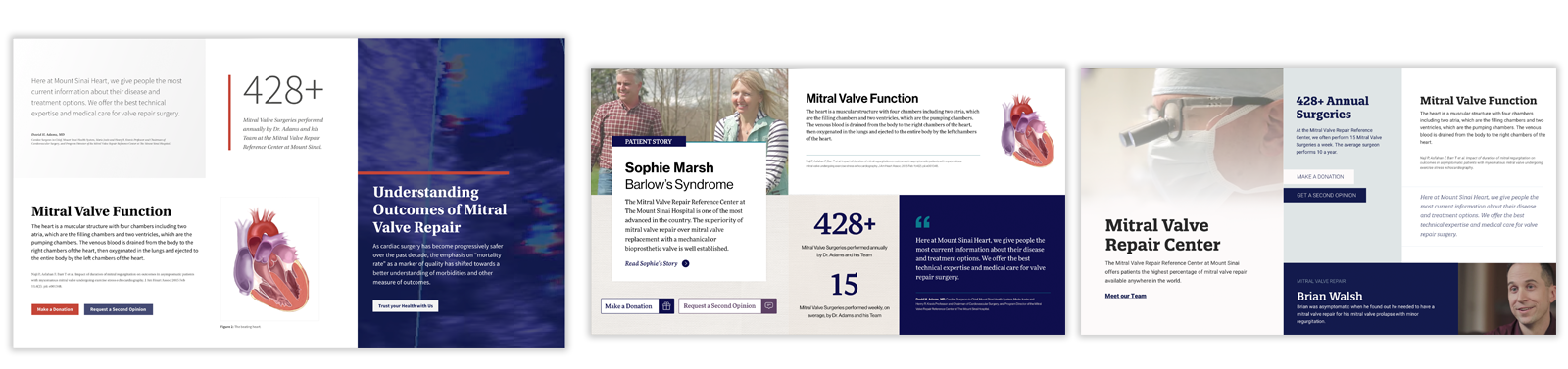
As an example, let’s say we have identified two personalities. Personality A is “Confident, Intellectual, Masterful, Excellence” and personality B is “Warm, Inviting, Open, Comforting.” The two personalities are different, but they don’t contradict each other, which is important. Now, If you were to close your eyes and picture a person or a website with personality A, and then do the same for B, you’ll most likely have two starkly different pictures.
Using these personalities to help guide our style tile creation serves two purposes. First, it helps guide the designer in creating distinct and unique options while staying on track with the identified design goals from discovery. Second, it is an easy way to demystify design thinking and design language by demonstrating our process and showcasing how we think about design elements holistically and providing familiar terms, which lowers the barrier for a productive design feedback session.
Once we have created the style tiles and presented them for feedback, our goal is to “Move Forward” rather than iterate on the style tiles. Typically we ask our clients to choose the option that best represents their brand’s personality in the digital space and to provide feedback on how it can improve. We then take this information and move into the static comp phase.
How We’ve Iterated Our Style Tile Process
Over time the Palantir design team has iterated on the original idea captured in Warren’s post in a few ways, and we have worked to discover efficiencies in our process.
One major change is that we don’t use labels. We chose to move away from labeling individual elements because we found it was distracting from the overall look and feel, and the use of labels forces the viewer to separate the utility from the “essence”. Instead of labels, we add a separate panel to the style tile which contains information about fonts, colors, and visual decisions. This panel allows us to be more descriptive, which in turn helps external teams as they share this deliverable with the broader team.
Second, we don’t iterate as much in style tiles as the original idea suggests. We try to keep it to one round of iterations or less before moving into comps. We found that the style tile process is efficient because we can generate ideas faster out of the gate by offering distinct options for review. Our iterations happen early and allow us to grow the design language as the design evolves. During the style tile phase, we look at the design system from ten thousand feet, and once we are further along we can become more detail oriented. We want to ensure we capture the essence before we start hammering out the details.
Additionally, we have started experimenting with introducing interactions and animations into the style tile phase of the project. Interactions and animations are an important part of how a site ‘feels’ to a user and can greatly enhance a design when added thoughtfully. Since style tiles are static, we do this by finding animation and interaction examples in the wild and pairing those with style tiles. This helps to start the discussion around animations earlier in the project.
Challenges With Style Tiles
One of the biggest challenges we face with style tiles is that they can be misinterpreted as page templates or layouts. We’ve done a few things to counteract this like masking certain components so that they look cropped, excluding the logo, and adding a slide with descriptive and instructive text to our presentation. Generally, we try to abstract the style tile board layout enough to disconnect the components from a page design.
For example, we avoid putting large hero banner components at the top, and we remove components that could be interpreted as a site header or footer. Additionally, we make sure that we specify the type of feedback we are looking for during the style tile presentations to minimize confusion. We ask for feedback that focuses on the look and feel, like the color palette usage or typographic hierarchy, and we explicitly request to exclude layout feedback.
Advice for Designers Creating Style Tiles
When creating style tiles, I recommend pushing the limits of your design skills. This is your chance to really explore some creative design ideas and present new design patterns. Since you are not constrained to a layout or to any existing content models, you can design with a freedom you won’t experience in the comp phase. Your sole focus in style tiles is to create compelling design elements.
It is also important to create distinct and differentiated design elements between the style tiles. This is your chance to show the breadth of your design capabilities, and once a tile is selected, you can showcase the depth of your skills! Each style tile should be drastically different in design and style. Creating more range in your style tiles not only helps to challenge yourself during this process, and but it also increases your chances of being right on or close to the mark of what the client is looking for. Remember, the goal is to agree on the right direction and then iterate from there.
Sometimes feedback includes a direction that incorporates two style tiles together. Don’t panic! That just means you hit the mark more than once. When this happens, be careful to gather the reasoning behind the feedback, then simply use your awesome design skills to create an incorporated design that best meets your client’s needs and represents their brand on the web.
Advice for Clients Reviewing Style Tiles
As a designer, I will use the feedback you provide on the style tiles to iterate into a page comp. To do this, I need clear, consolidated, and decisive feedback. I need to understand what is and is not working for you, so that I can help to identify how to iterate to better capture your brand in the digital space.
When reviewing each style tile, think about the following:
- Does it communicate your brand effectively?
- Does it feel like the personality of your brand?
- How does the style tile “feel” to you? Does it feel right?
- Is it generally too open, too cramped, too busy, too simple, just right?
- How is each component on a tile working alone and with the group as a whole?
- What do you really love about the style tile? Why?
- What would you change about the style tile? Why?
When providing feedback, remember:
- This is not a layout, the components you see will be presented within different contexts in the final designs.
- Try not to provide solutions, but rather explain to us the problems. We are designers and we are really good at solving visual design problems. Providing solutions could prevent us from coming up with a better more creative solution.
- When providing a piece of feedback, try to explain the ‘Why’. The more descriptive you can be with your feedback, the better we will be able to iterate in the right direction.
- It is best to choose the ‘most correct’ direction and then iterate from there. Don’t be afraid to make a decision because it ‘isn’t quite right yet’.
- Don’t be afraid to take risks! If you see a component you’ve never seen before, don’t immediately reject it. Consider what problems it is solving and if it is solving them well. We want you to have a beautiful and usable final product.
Some of Our Favorite Client Style Tiles
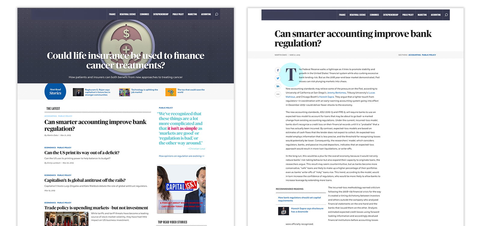
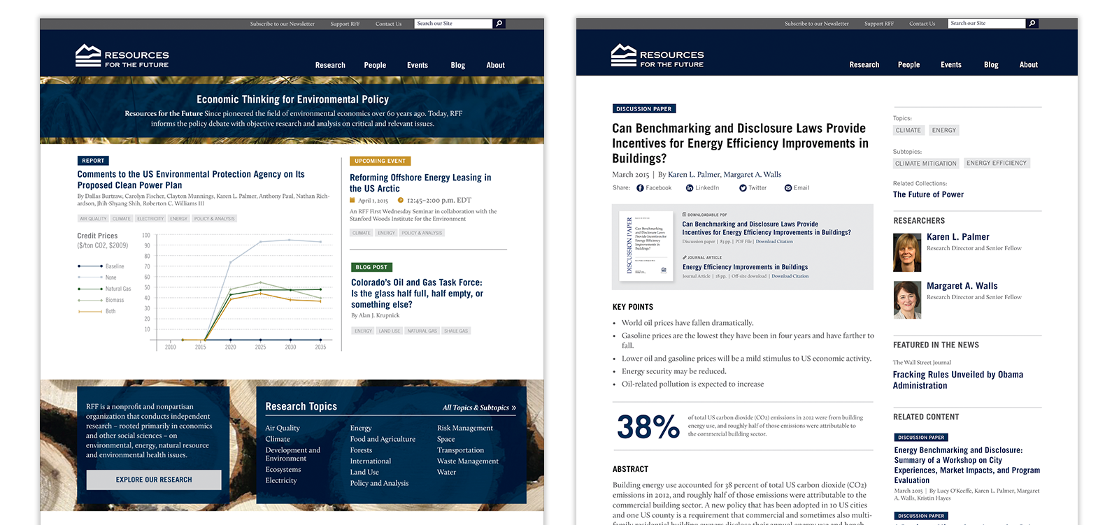
Style tiles have been a great tool for our team to gain efficiency and solicit important feedback during the design phase of the project. Below are some examples of style tiles we’ve created for clients and how the final site turned out.
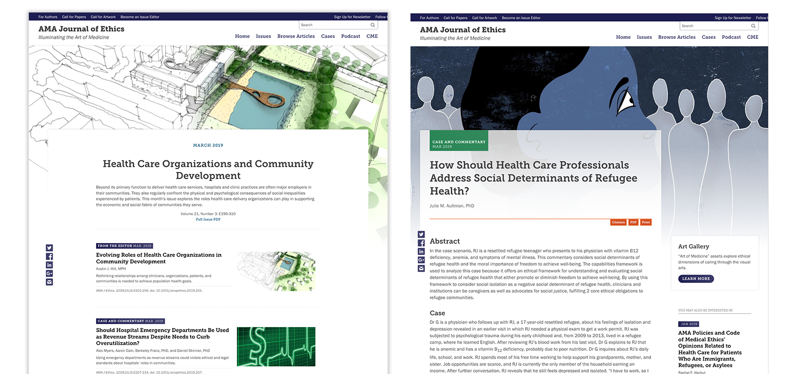
American Medical Association Journal of Ethics
Prominent Midwest Business School
Resources for the Future
South Dakota State University

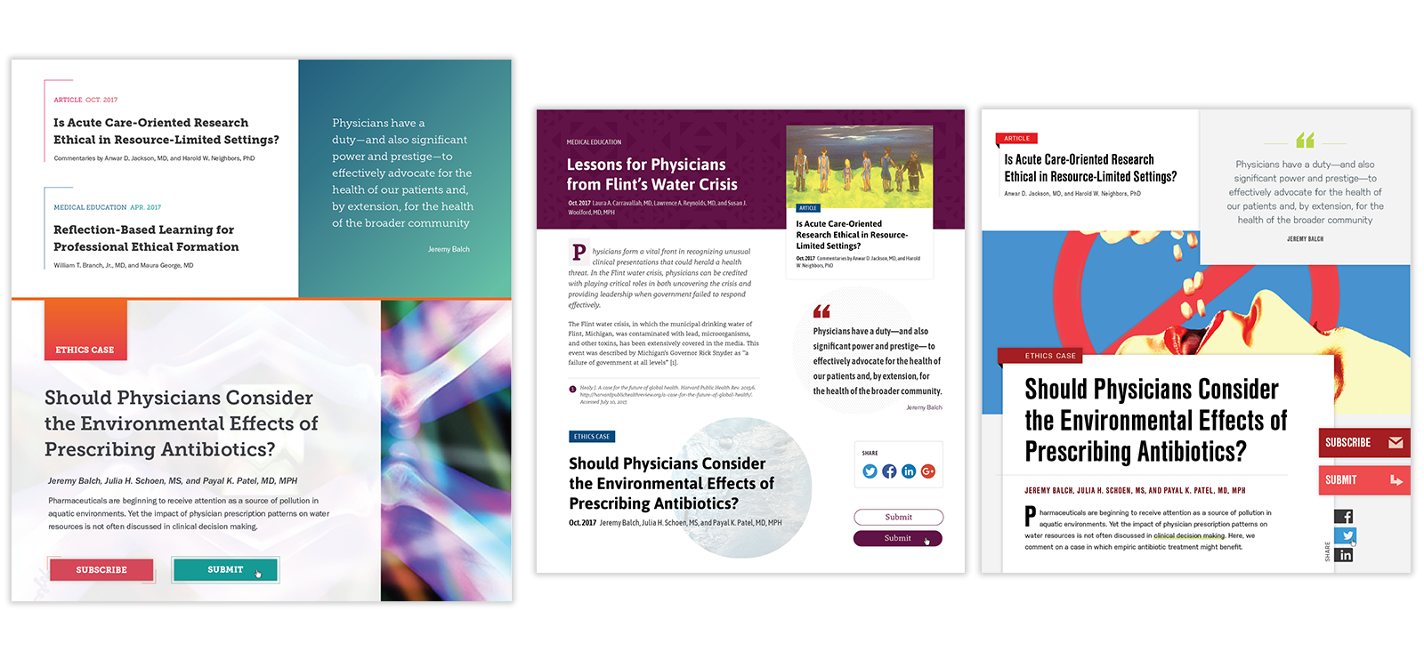
Prominent Law School Legal Journals
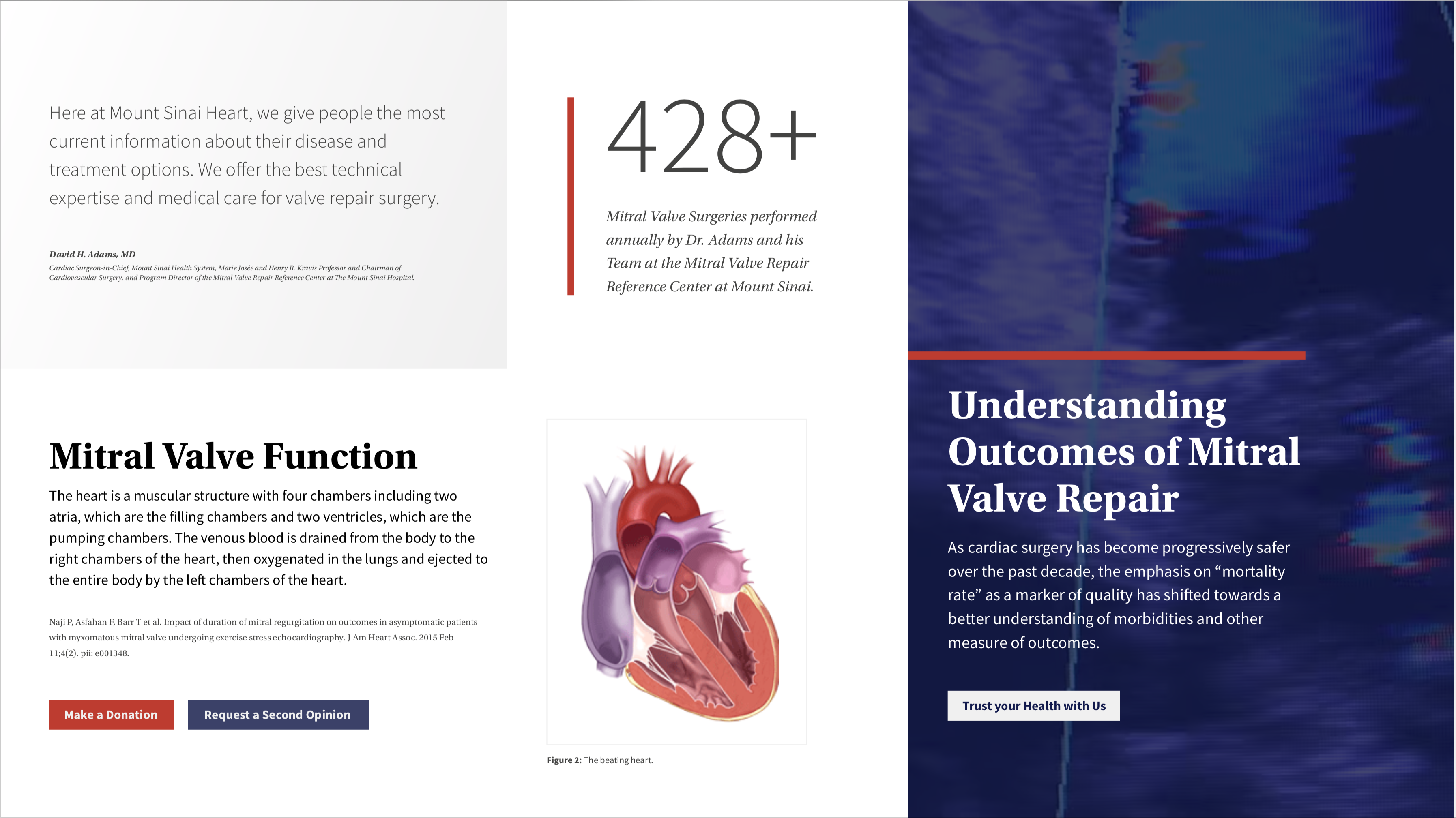
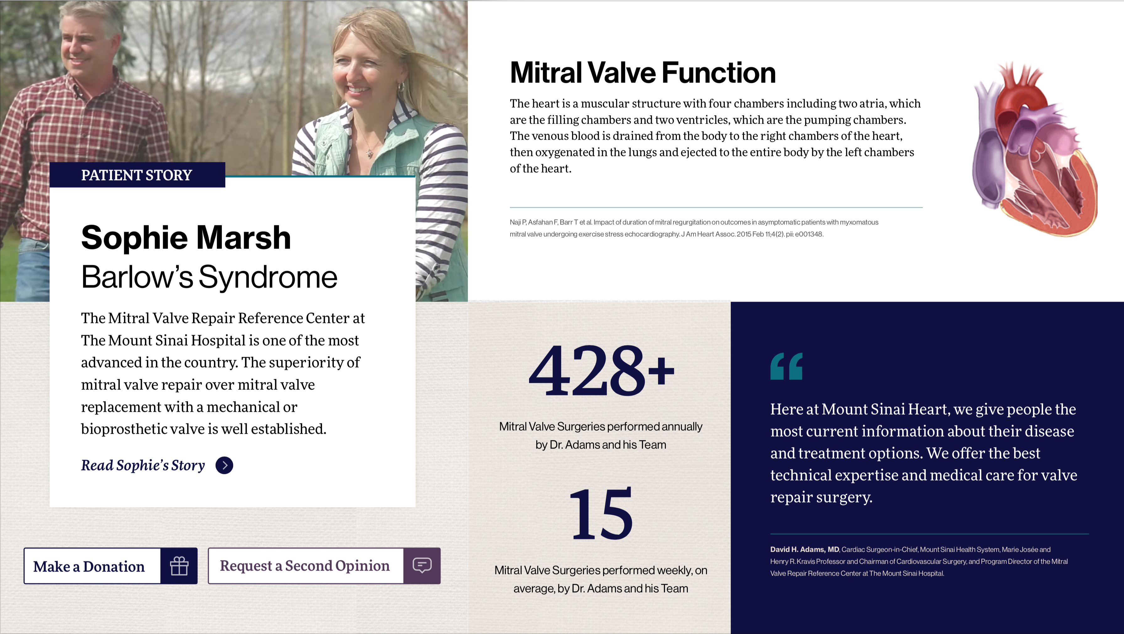
Mount Sinai Mitral Valve Repair Center
We want to make your project a success.
