Case Study
Prominent Midwest Business School
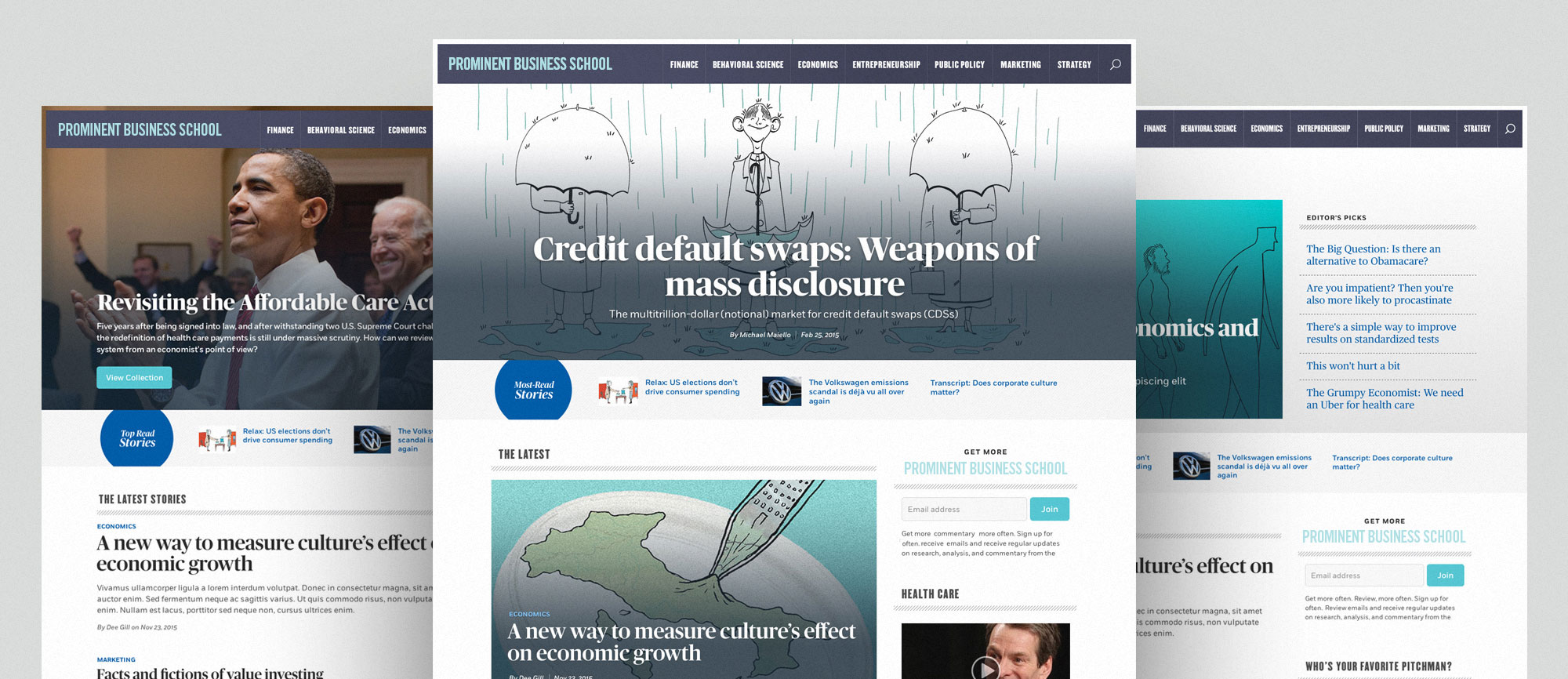
Visibility of Research and Ideas Through a Beautiful Design
Highlights
A highly customizable layout to showcase our client's content.
- Highly customizable layout
- A strong visual hierarchy punctuated with thoughtful typographic details
- Robust tagging and taxonomy for showcasing content
- This project was nominated for a Webby!
One of the oldest business schools in the country with a worldwide network of over 50,000 alumni, our client is one of the top-ranked business schools in the world. With a reputation for new ideas and research, it needs its online presence to reflect its bold, innovative approach to business education.
Our client’s approach to learning is to, “constantly question, test ideas, and seek proof,” which leads to new ideas and innovative solutions within business. Beyond the classroom, this approach empowers thought leaders and analytical minds to shape the future through deeper analysis and discovery.
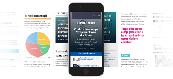
In order to create greater visibility of the school’s research and ideas, the school publishes digital and print publications that give insight to business leaders and policymakers who can act upon those ideas. The publications help convey the concepts and research findings generated by the school, as well as by academics outside the school, via articles, infographics, charts, videos, and other devices.
Since both publications were due for an upgrade, our client decided to update its web presence and quarterly print magazine at the same time. With our client having already partnered with another firm to complete the magazine design, Palantir was brought in to design and develop the website in a way that provided cohesion between the two mediums.
Goals and Direction
Because the publication’s previous site was outdated and not optimized for mobile devices, the overall performance was less than ideal, with long loading times causing problems on tablets and smartphones. Additionally, the hierarchy on the old site needed some rethinking: the site was difficult to navigate, with limitations on how articles and videos could be connected, since visitors couldn’t easily or effectively filter or search the contents of the site.
The primary high-level goals for the redesign were to:
- Move the site to Drupal, which allowed for increased community support and more flexibility in tools that could be incorporated
- Provide an experience that demonstrated the depth of content from the publication
- Optimize content search and social visibility
- Provide a flexible platform that would evolve as the content evolved
- Highlight visuals and alternative story formats
- Leverage content featuring the business school’s high-profile faculty
To accomplish the majority of these goals, a well-planned content strategy was required. The new site needed the ability to display content in a variety of ways in order to make it digestible and actionable for readers. All content had to be easily sharable and optimized for the greatest possibility of distribution. Lastly once readers found content they wanted, related content should surface as well.
To support the content strategy, site editors needed the power to elevate content connections and relations through a strong visual design that offered flexibility, and with hierarchy that made sure news matched what visitors were looking for. They also required options on how to best showcase content, as well as the ability to include multiple storytelling mechanisms.
Site Focus
Once goals were outlined, Palantir worked to create a solid content strategy for the site. Taxonomy and tagging were addressed, and a new information architecture was put in place in order to make sure content was being seen and surfaced at the right time. After the initial strategy work was completed, it was decided to focus the work in two key areas:
- Increase the number of pages during each visit. Prior to the redesign, a large percentage of visitors were coming in from search and social for a single article and then leaving before accessing any more articles, videos, or graphics. The former content management system made tying in related content difficult, so attention was given to each step of the process to make sure that related content could be easily surfaced by editors or by the system based on tagging. A goal was to give visitors more of the type of content they were looking for.
- Improve number of visits per month. As important as it is to make navigating the site better, ensuring that visitors could find the content more easily was a key improvement that was needed for the site. As part of that, the site required better metadata for search and social optimization.
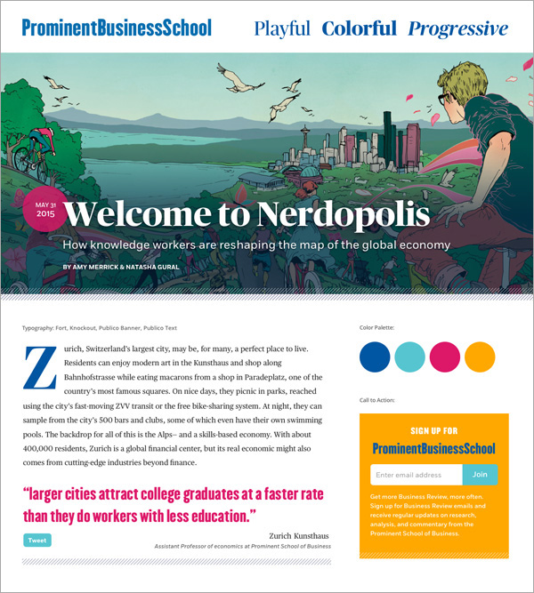
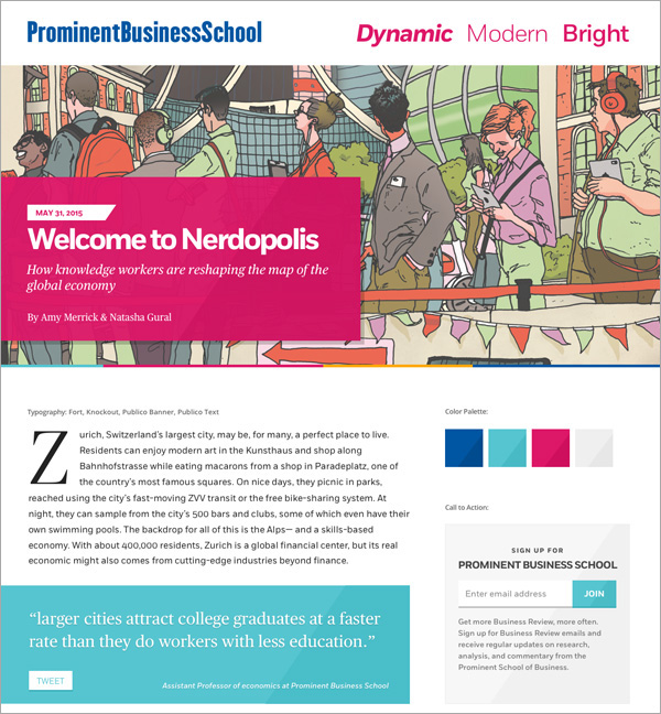
The design of the site was critical to achieving the goals, and we were given latitude to push the boundaries of the existing brand standards in order to give the magazine a distinctive look through color and typography. Our design team expanded the existing brand signals from our client in order to create style tiles to represent the general mood, typography, and colors recommended for the new site. With the variations in image treatment, typography, color palette, and button/quote designs, each style tile worked to capture a specific voice and personality for the magazine. This allowed us to quickly gauge how our client wanted to present itself to the world prior to starting formal layouts.
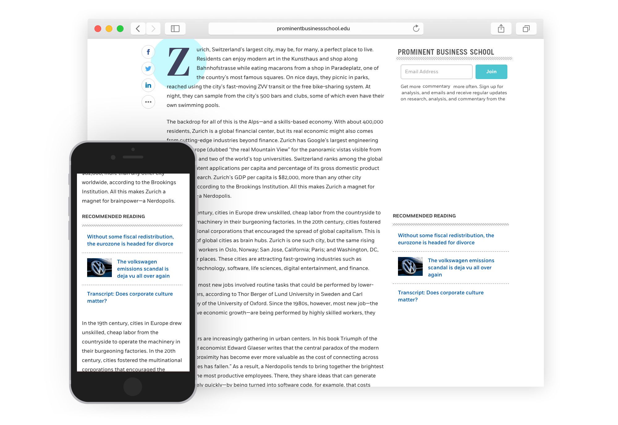
Once the final direction was chosen, we concentrated next on wireframing the pages so we could marry the functionality with the intended hierarchy and ensure that the revised content strategy was working as efficiently and powerfully as possible. Given that users spent the majority of time on those pages, individual article pages were given particular emphasis in wireframing, to ensure users would be enticed to explore further into the site.
In the layout phase, typography was given special attention, with drop-caps and call-out quotes being implemented to keep a print feel and break up a sea of gray text for long articles. This approach was particularly necessary on the mobile view, allowing the content to take center stage without losing any of the design details. Sharing on social media was also accounted for, with shorter quotes having their own dedicated sharing buttons. Additionally, the wealth of artwork provided by the school’s internal team created exciting opportunities for our design team on all applicable articles.
While not always the entry point for users, the homepage design needed to be as flexible as possible. Not only did we have to account for the hierarchy of stories and surface related content in the right way, but to allow for multiple types of content to be displayed while balancing related articles and email newsletter sign-up forms.
The Results
In the end, our client received a beautiful design that showcases the content well, and provides easy access to related content. Back-end editors are happy with the improved formatting and editing ability, with one editor saying, “it’s not even comparable to our previous site.” Our designs introduced new ways of visually displaying a wealth of content and helped push innovation for the magazine redesign. The print designers were able to apply our design signals to the associated print piece, creating a strong cohesion across all collateral to enhance the school’s brand.
The variety offered by the new homepage design supported the goal of increasing the page views, providing more opportunities to entice people to continue their experience, with connections between different articles and videos. With much of the greater University on Drupal, the move to Drupal also allowed the staff increased support within the school community. The flexibility of the modular design and build allowed staff to control the process and to be able to leverage important research to audiences and policymakers for years to come.