Skip to Main Content
Menu
Close Menu
UHealth homepage on a tablet

University of Miami Health System

Creating a design system to power a health system

Giving audiences the information they need in order to be healthy

The University of Miami Health System (UHealth) delivers leading-edge patient care by the region’s finest physicians, powered by the groundbreaking research and medical education of the University of Miami Leonard M. Miller School of Medicine. 
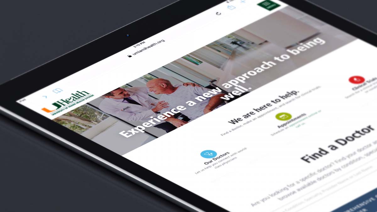
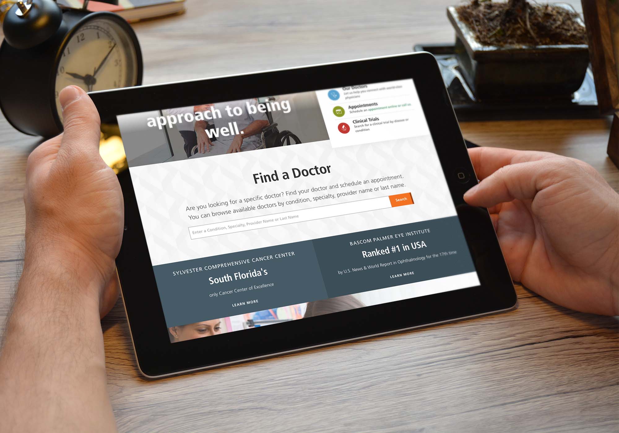
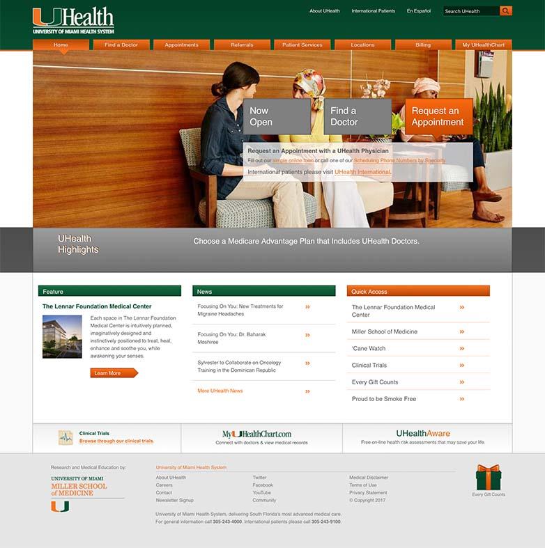
Visit Site

UHealth teamed up with Palantir to redesign their digital platform from 190 sites to just two: UHealth and the Miller School of Medicine. To achieve this vision of a unified platform, we focused our work on:

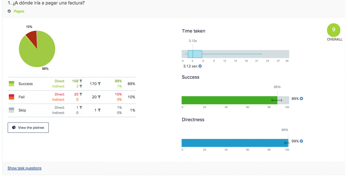
  • Bi-lingual user-tested navigation: Because we were merging nearly 200 individual websites into just two, we dedicated significant effort to developing and testing the site information architecture and navigation. The UHealth audience has a large Spanish speaking population, so we conducted tests in both English and Spanish.
  • A design system: We replaced UHealth’s static page templates with a comprehensive design system that allows the marketing team to spin up beautiful, on-brand, user-friendly pages as needed.
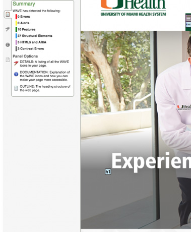
  • WCAG AA compliance & responsive design: Our design system was built to WCAG AA standards and delivers a beautiful interface on any screen size.
  • Search strategy: When a user searches for information they should be able to scan the results quickly and easily. Our content modeling work was geared towards ensuring content was easy for search engines to group and parse.

The challenge

UHealth’s digital presence was initially owned by the IT department, which spun up more than 600 static websites: one each for the UHealth system’s service lines, departments, and clinics. When the marketing team took over, they solved for some of the most pressing interface problems by slimming down the 600 sites to 190, and creating a set of static page templates so that the individual websites delivered a unified look and feel.

While this was a distinct improvement, the page templates were not mobile responsive or WCAG compliant, and they made it impossible for the marketing team to build new interfaces as new needs arose.

This new digital presence is a great leap forward for us as a health care system, one that brings UHealth up to date in the digital realm, and provides an optimal interface for our patients to learn more about the care we provide.

Edward Abraham, M.D.
Executive Vice President for Health Affairs
CEO, UHealth

A team effort

Palantir delivered a digital style guide with all of the front-end code for the new design system. The system was then implemented in the Sitecore content management system and the UHealth team rewrote all of the copy for the new platform.

UHealth homepage after After

Bi-lingual user tested navigation

In order to successfully streamline the UHealth digital platform from 190 sites to 2, we performed 18 user tests in two languages:

  • Information Architecture/Menu testing in both Spanish and English: The first round of menu testing focused on establishing a baseline for the effectiveness of the current main navigation structure on the Spanish and English language UHealth websites. The second round focused on validating the site map that we develop as part of this project. We tested several menus to cover both the primary site navigation and the Center of Excellence sites, which had their own “microsite” navigation.
  • Page strategy testing in both Spanish and English: These tests were to validate the page level strategy - can visitors quickly and accurately identify where to click on a page to accomplish their task on the site?


These user tests were crucial to the success of the redesign in two ways:

  1. Testing surfaced important issues with conversion and allowed us to fix them before launch. A notable example was that visitors couldn’t figure out how to access a message from their doctor. The branded term for the patient portal didn’t cue visitors, so instead, we named the patient portal “patient log-in.”
  2. Quantitative data simplified decision making. Health system redesigns have a lot of stakeholders, and building consensus is tough. Our client product owner found that having quantitative data to back up our recommendations made it substantially easier to get approval to move forward.
Screenshot of user testing results

Design system

An important goal with this redesign was to give the UHealth marketing team more flexibility so they can scale easily and adapt as new content needs arise. This meant creating a situation where they would not be bound to rigid, static page templates.

We built a comprehensive design system - a series of elements, components, and templates that can be reused in different ways to spin up new pages and microsites, all while delivering a branded, consistent experience.

UHealth Sports Medicine Institute homepage on a tablet

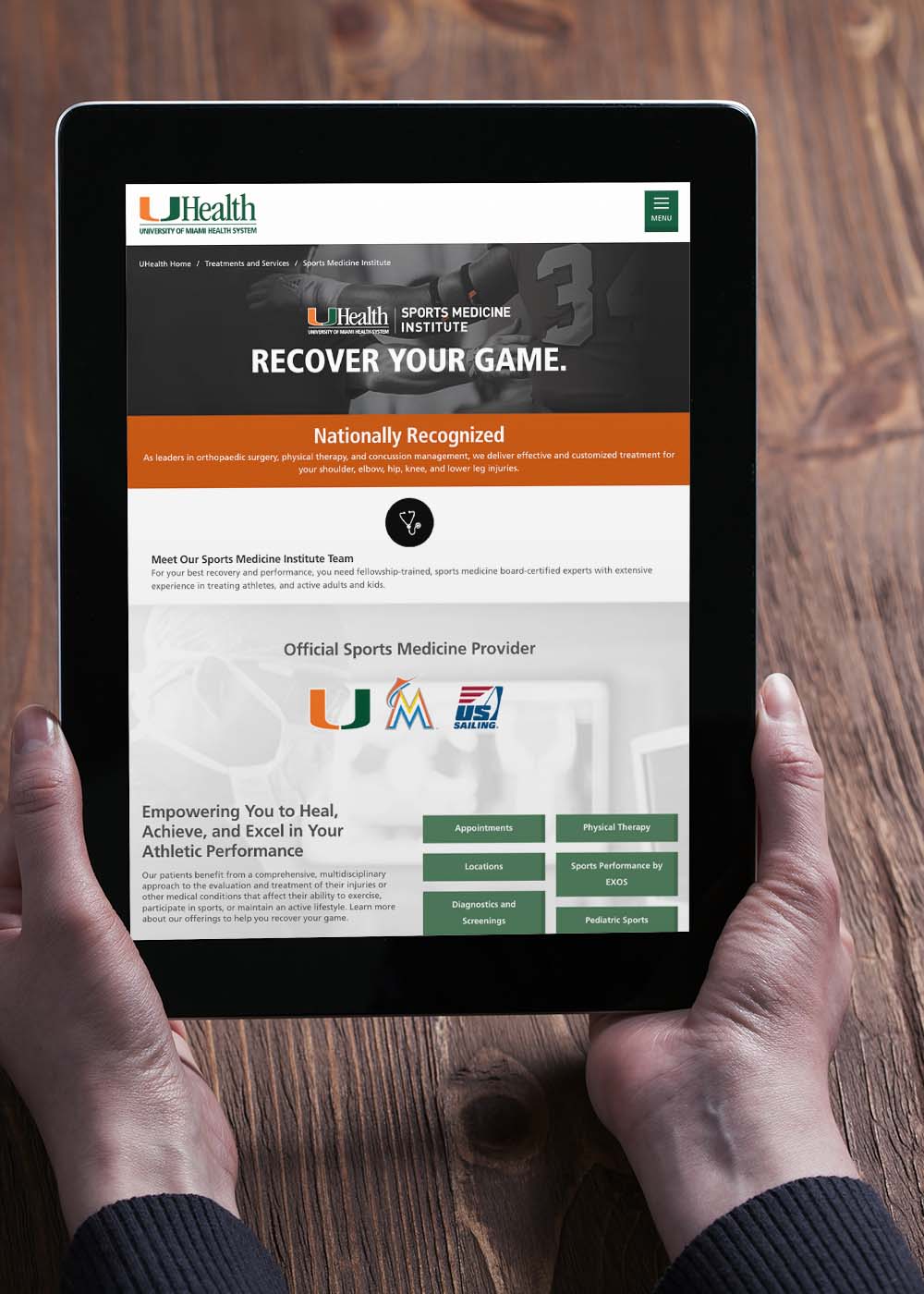
WCAG AA compliance and responsive design

Health systems must be able to reach people where they are, both in terms of accessibility and in terms of devices. Even without a responsive design, 15% of UHealth’s traffic came from mobile. As a result of our redesign, those users are getting a drastically improved experience and we expect the rates of mobile usage to rise. WCAG AA compliance is also a concern; every element in our style guide was tested with Siteimprove accessibility checkers to ensure that our design met the needs of all users.

Portion of the UHealth homepage with WAVE accessibility results

Search strategy

We knew search was one of the most important things to address with UHealth’s site wayfinding. Previously, there was little clarity on what type of content was returned in a search, the results were difficult to parse, and the hierarchy of results was inconsistent. In general, it wasn’t easy for users to vet search results before clicking on their selection. We completed extensive research on different search tools to see what would make sense in terms of how to visualize different content groupings and returned search results.

Our search strategy centered around the following guidelines, which were used by the UHealth content team as they revised the content for the new platform.:

  • Surface what is most important to users. Group types of content together, and make it so that there is less work involved in users’ decision making.
  • Parse out information in a way that allows it to be more scannable. Surface specific content so patients have an avenue to get to doctors very easily.
  • Give the user what they expect to get. Visitors might not know they are looking for certain types of information, so ease them into the tool and build empathy.
UHealth LASIK Center page on a laptop
UHealth Clinical Trials page after After

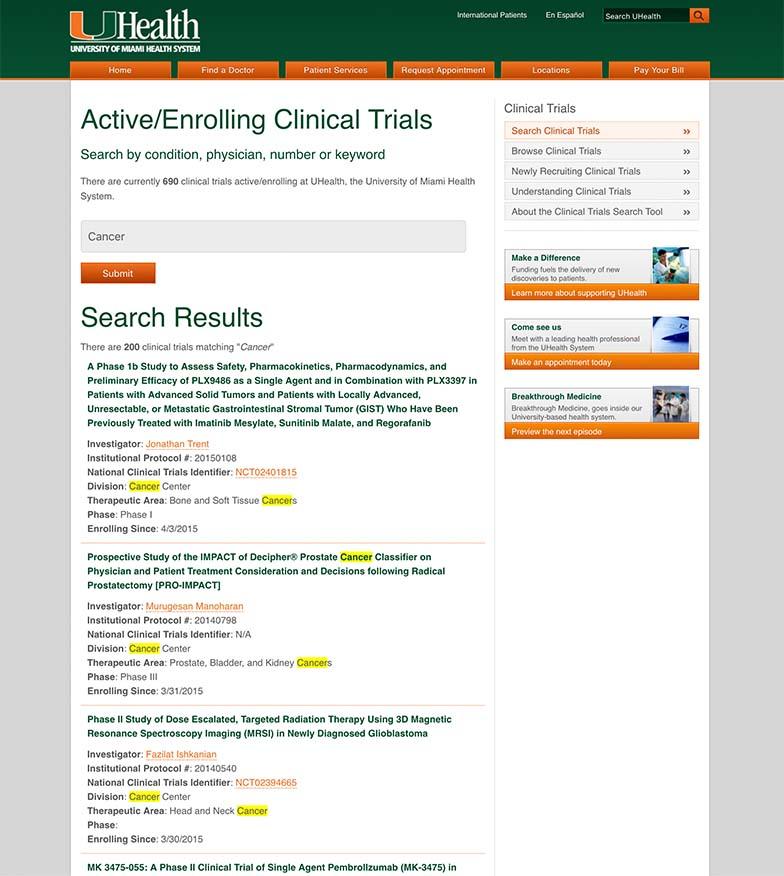
A revamped clinical trials page

Patients often turn to clinical trials when they have given up on more standard methods of treatment, and they need to be able to find information efficiently about the options that are available to them. As a key differentiator for UHealth, it was imperative that we redesign this very critical area of the UHealth digital ecosystem, the Clinical Trials page.

Prior to the redesign, it was hard to get UHealth’s important clinical trials information to appear in search engines, and it was also difficult to find when navigating on their site. Once on the clinical trials page, there was no lead form, a lot of information found on those pages wasn’t necessarily for patients, and it was difficult to determine what trials were open or closed.

With the redesign, UHealth made it easier for patients to find information on clinical trials and improved the way people could navigate these pages. A key difference is in the search functionality: now visitors can search by both keyword and from a drop-down list of specialties.

Moving forward

The new UHealth digital platform launched in 2018, and won the Silver eHealthcare Leadership Award for Best Patient Access and Convenience. Palantir and UHealth continued to partner on the redesign for the second half of the UHealth digital platform: the Miller School of Medicine.

UHealth homepage on a tablet

Let’s work together.

Have an exceptional idea? Let's talk and see how we can help.

Contact Us